A Real-Time Map of Births and Deaths
A staggering realtime visualisation of how the world population is growing, and where.
From Weekly Filet #135, in November 2013.
🔗

A collection of some of the best links from around the web, manually curated.

A staggering realtime visualisation of how the world population is growing, and where.

There’s something about these hand-drawn maps that tells the story more intensely than with the usual maps and illustrations we’ve seen on the matter.
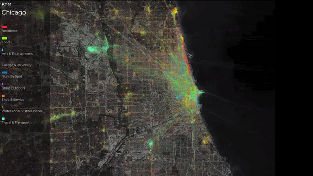
Digital traces in the physical world. Our smartphones are the digital recorders of every step we take and every move we make (they’ll be watching us, sorry Sting for the pun). These timelapse visualisations made by location-based social network Foursquare show how people move in big cities like London, New York, Tokyo or Istanbul over the course of a day (you might remember a similar project about Geneva, Ville Vivante). It’s a beautiful display of the pulse of big city life, but should serve as a reminder that the data is out there and can be used for less beautiful purposes.

New data from the United Nations Population Division, nicely illustrated and explained by the Washington Post, will blow your mind. By 2100, Africa will grow from 1 billion to 4 billion people. Nigeria will close in on China. Tanzania will have one of the largest populace in the world. Developed countries will shrink, with the notable exception of the USA, which will grow a lot. And then, there’s this: In one key metric, the dependency index, Europe will have switched roles with Africa by 2100.
Maybe we can stop whining about immigration to our shiny counties now? This puts a lot into perspective. Most striking fact: The four most populous refugee camps in the world are all in the same country.
This is brilliant: A visualisation of all music genres and their corresponding bands and artists. Complete with sound samples, of course.
Probably the best, most intelligible infographic on the impact of climate change you’ll find.
Skateboarding tricks, turned into stunning 3D-visualisations, thanks to an onboard iPod touch.
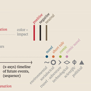
Envisioning the future is a recurrent theme in novels. Italian information designer Giorgia Lupi has created this stunning visualisation of «the future, as foretold in the past». Behold of 2023: «A mutant great white shark stalks the sewers of New York City.»
Make sense of what’s happening, and imagine what could be.
Carefully curated recommendations on what to read, watch and listen to. For nerds and changemakers who love when something makes them go «Huh, I never thought of it this way!».Undecided? Learn more | Peek inside
Immerse yourself in a particular topic, with some of the best links from around the web, handpicked.
39 recommended links
38 recommended links
20 recommended links
13 recommended links
26 recommended links
34 recommended links
16 recommended links