
Carefully curated recommendations for curious minds who love when something makes them go «Huh, I never thought of it this way!».

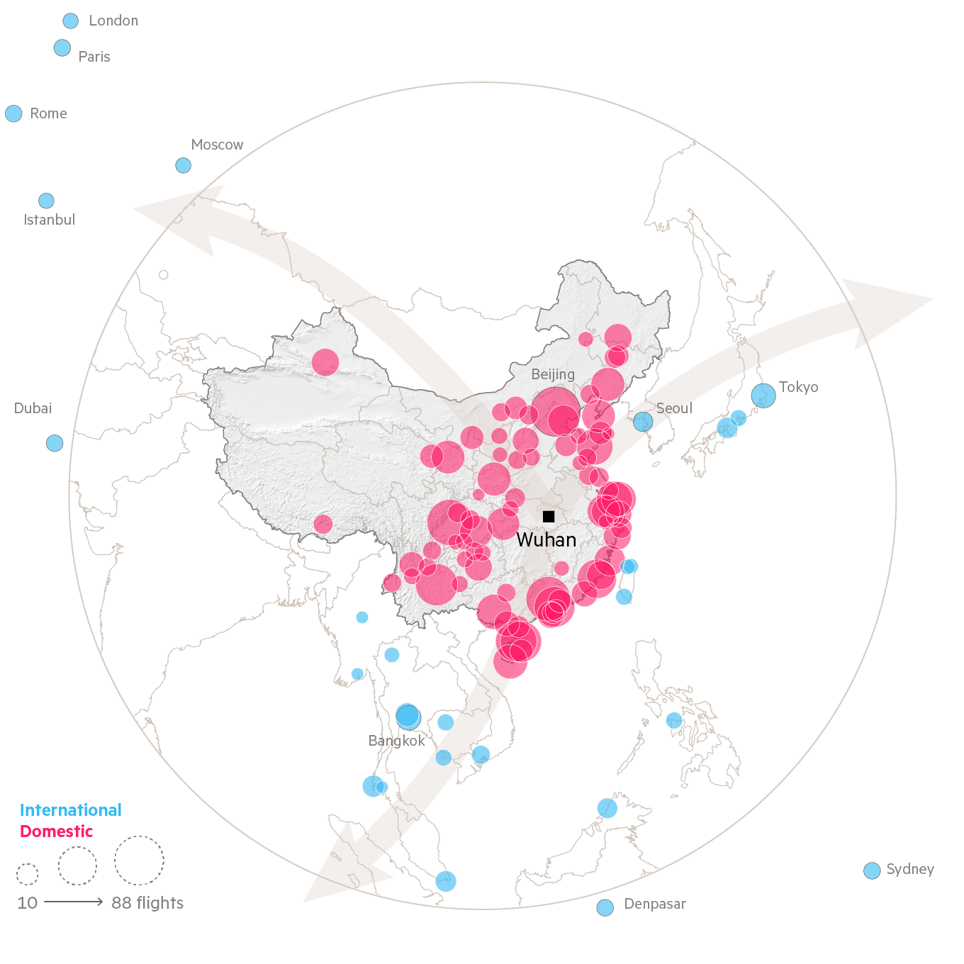
If journalism is, as they say, the first rough draft of history, this is as good as it gets on the 2020 coronavirus pandemic. The Financial Times has compiled all the relevant data that help understand the scale and impact of Covid-19, and take us on a chart-heavy journey from early January to today. The take-away chart, for me at least, is the one showing that fighting the pandemic is not a balancing act between public health and the economy. If you fight it effectively, you get better outcomes for both.
From Weekly Filet ##322, in October 2020.


Explore collections
